Ever visited a website that just felt... wrong? It likely broke Jakob’s Law; one of UX design’s golden rules. If your site doesn’t work like other sites people use every day, they’ll get confused, annoyed, and bounce.

What is Jakob’s Law in UX?
Jakob’s Law (named after usability expert Jakob Nielsen) is simple:
"Users spend most of their time on other websites. They expect yours to work the same way." (Jakob Nielsen)
In other words, people don’t want to "learn" how to use your site. They expect navigation, layouts, and interactions to be familiar. If your website does things differently, just for the sake of being different, you’re making them work harder. And that’s never a good thing.
Why ignoring Jakob’s Law hurts your website’s usability
Some designers try to be unique by changing standard design patterns. They put the navigation at the side, use hidden menus in places where users don’t expect them, or reinvent buttons, . The problem? It confuses people.
Here’s what happens when you ignore Jakob’s Law in web design:
Users get frustrated – If they can’t find what they need fast, they leave.
Higher bounce rates – People don’t stick around to figure out your “cool” navigation. They just go to a competitor’s site instead.
Lost credibility – If your site feels weird or unintuitive, visitors might think your business is unprofessional too.
Just becase you as the creator think something is super clear and easy to understand doesn't mean everyone else will think the same.
How to use Jakob’s Law to improve design
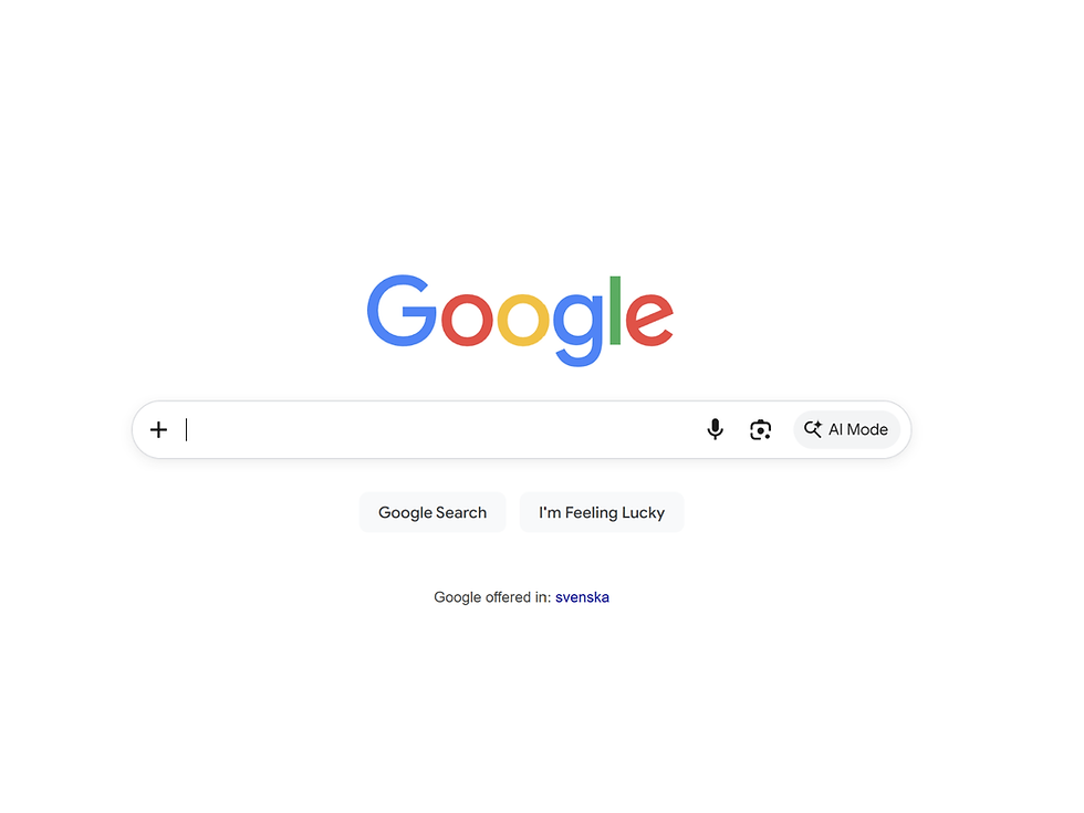
There’s a reason why almost every major website follows the same structure:
✓ Logo in the top left
✓ Navigation at the top
✓ Clickable buttons that look like buttons
It’s not because designers lack creativity, it’s because this works. Users don’t want to waste time figuring out how to use your site. They just want it to feel natural and intuitive.
When is it okay to break Jakob’s Law?
Jacob’s Law doesn’t mean you can never experiment. It just means that if you do, you need a good reason. For example:
Innovative products – If your app or website introduces a new concept, users might be more open to learning a new way of interacting.
Small, controlled changes – Adding micro-interactions or unique animations is fine as long as the core structure remains familiar.
User-tested improvements – If you’re making a change, test it! If users struggle, it’s probably not worth keeping.
Final thoughts
Good web design isn’t about being different. It’s about being usable. If your site is frustrating, visitors will leave no matter how “creative” it looks. Stick to familiar patterns, make navigation intuitive, and remember: the best UX is invisible.
Now, take a look at your website. Are you helping users or confusing them?
To dive deeper into essential web design mistakes and their solutions, check out my article on common web mistakes and how to fix them.
💡Quick recap
What is Jakob’s Law? Users spend most of their time on other websites, so they expect yours to work the same way.
Why is it important in web design? Ignoring Jakob’s Law makes websites confusing, which leads to frustration, higher bounce rates, and lost conversions.
How can I apply it to my site? Stick with familiar navigation, consistent layouts, and predictable interactions to keep your UX intuitive.

Your website’s homepage is trying to do too much
Your website’s homepage is trying to do too much
Web & UX Design

Why people don’t read your content (what they do instead)
Why people don’t read your content (what they do instead)
Web & UX Design

5 things I've learned from working with linkedin marketing
5 things I've learned from working with linkedin marketing
Marketing

Vill du veta
mer om mig?
Explore my work
Webbdesign

Norrklint
Norrklint är ett svenskt fintechbolag som hjälper små och medelstora företag att hitta finansieringslösningar. För deras varumärke arbetade jag med att ta fram en ren och modern visuell identitet som förmedlar förtroende, tydlighet och professionalism. Designen fokuserar på intuitiva gränssnitt och tydlig kommunikation, vilket gör komplex finansiell information enklare att förstå för användarna.
Tools used
Wix Studio & Recraft
Webbdesign

Karlsson bil
Karlsson Bil är en bilhandlare baserad i Varberg som köper, säljer och renoverar fordon, bland annat den exklusiva serien Lignon Scandinavia med handbyggda Land Rover Defenders.
I projektet arbetade jag med att ta fram en webbdesign som kombinerar den klassiska Defenderns arv med ett modernt och stilrent uttryck. Fokus låg på att skapa en smidig och intuitiv upplevelse där besökare enkelt kan utforska aktuella fordon, läsa om specialbyggda renoveringar och få en tydlig bild av processen kring köp och försäljning.
Tools used
Wix Studio & Custom code
Webbdesign & Branding

Carin Fredén
Carin Fredén är en Malmöbaserad fotograf med fokus på högkvalitativ företagsfotografi och visuell varumärkeskommunikation. Hennes webbplats presenterar hennes arbete och tjänster och hjälper företag att stärka sin visuella identitet genom bilder.
Tools used
Wix Studio, Figma & kod


